Showing posts with label CSS. Show all posts

Saturday, 24 August 2013

membuat tulisan marquee keren dengan menambah css


Biasanya default efek marquee di buat dengan kode html berikut.
<marquee>SELAMAT DATANG DI BLOG ANDOELSEAN</marquee>,hasilnya seperti di bawah ini.  
SELAMAT DATANG DI BLOGNYA ARIEADIE
  Namun pada postingan saya kali ini saya akan menambahkan kode css,untuk memperindah efek marquee,sehingga hasilnya akan menjadi seperti di bawah ini.

SELAMAT DATANG DI BLOGNYA ARIEADIE,SILAHKAN BACA ARTIKEL MENARIK LAINYACode untuk membuat marquee seperti di atas adalah:

<div class="marqueeart2">
<marquee style="color: white; font-family: Times New Roman; font-size: 30px; text-shadow: 2px 2px 4px #000;">SELAMAT DATANG DI BLOGNYA ARIEADIE,SILAHKAN BACA ARTIKEL MENARIK LAINYA</marquee></div>
<style>
.marqueeart2 {
border-radius:6px;
border:1px solid #1E90FF;
border-left:5px solid #1E90FF;
border-right:5px solid #1E90FF;
background-image: -ms-linear-gradient(top, #FFFFFF 0%, #00A3EF 100%);
background-image: -moz-linear-gradient(top, #FFFFFF 0%, #00A3EF 100%);
background-image: -o-linear-gradient(top, #FFFFFF 0%, #00A3EF 100%);
background-image: -webkit-gradient(linear, left top, left bottom, color-stop(0, #FFFFFF), color-stop(1, #00A3EF));
background-image: -webkit-linear-gradient(top, #FFFFFF 0%, #00A3EF 100%);
background-image: linear-gradient(to bottom, #FFFFFF 0%, #00A3EF 100%);
}
</style>
Untuk menggunakan kode di atas,pada saat akan memasukan effect marque pada postingan beralih dulu dari mode Compose ke HTML,kalau belum mengerti lihat gambar dibawah ini. . ! !
Mode postingan di blogger
Nah jika anda ingin mengedit kode marquee'nya,silahkan ganti kode yang berwarna sesuai yang anda inginkan. .
KETERANGAN:
  • Kode yang berwarna ORANGE di atas adalah untuk kata-kata dalam marquee,silahkan ganti dengan kata-kata yang anda inginkan. 
  • Border-radius:itu untuk sudut lengkung pada kotak marquee,nilai 6px bisa anda ganti dengan yang anda inginkan 
  • Border:untuk garis tepi pada kotak marquee,silahkan disesuaikan nilai dan warnanya sesuai yang anda inginkan 
  • Border-left:itu untuk border sebelah kiri silahkan atur ketebalan dan warnanya. 
  • Border-right:Untuk border sebelah kanan 
  • Dan kode yang berwarna MERAH,itu untuk css background gardient,silahkan anda ganti sesuai yang anda inginkan,


Thursday, 22 August 2013

Better Blockquotes with css


A popular technique is to put large graphical Quotation marks at the upper left and lower right of the blockquote area. In these pre-CSS3, non-multiple-background days, there is no good way to do this without a little extra HTML. The easiest technique is to add a <span> element along with the <blockquote> element. Not ideal, but it works. You can apply most of the styling the blockquote element in your CSS and then set the second background image with the span. Upper left and lower right respectively.

Here are some examples:

Classy Quote


blockquote.style1 {
  font: 14px/20px italic Times, serif;
  padding: 8px;
  background-color: #faebbc;
  border-top: 1px solid #e1cc89;
  border-bottom: 1px solid #e1cc89;
  margin: 5px;
  background-image: url(images/openquote1.gif);
  background-position: top left;
  background-repeat: no-repeat;
  text-indent: 23px;
  }
  blockquote.style1 span {
     display: block;
     background-image: url(images/closequote1.gif);
     background-repeat: no-repeat;
     background-position: bottom right;
   }


Modern Quote


blockquote.style2 {
  font: 14px/22px normal helvetica, sans-serif;
  margin-top: 10px;
  margin-bottom: 10px;
  margin-left: 50px;
  padding-left: 15px;
  border-left: 3px solid #ccc;
}

Fun Quote


blockquote.style3 {
  font: 18px/30px normal Tahoma, sans-serif;
  padding-top: 22px;
  margin: 5px;
  background-image: url(images/openquote3.gif);
  background-position: top left;
  background-repeat: no-repeat;
  text-indent: 65px;
  }
  blockquote.style3 span {
    display: block;
    background-image: url(images/closequote3.gif);
    background-repeat: no-repeat;
    background-position: bottom right;
}

Fancy Quote


blockquote.style4 {
  font: 14px/20px italic Times, serif;
  padding-left: 70px;
  padding-top: 18px;
  padding-bottom: 18px;
  padding-right: 10px;
  background-color: #dadada;
  border-top: 1px solid #ccc;
  border-bottom: 1px solid #ccc;
  margin: 5px;
  background-image: url(images/openquote4.gif);
  background-position: middle left;
  background-repeat: no-repeat;
  text-indent: 23px;
}

Code Quote


blockquote.style5 {
  font: 12px/18px normal "Courier New", sans-serif;
  padding-left: 70px;
  padding-top: 2px;
  padding-bottom: 2px;
  background-color: #000;
  color: white;
  border-top: 1px solid #ccc;
  border-bottom: 1px solid #ccc;
  margin: 5px;
  background-image: url(images/openquote5.gif);
  background-position: middle left;
  background-repeat: no-repeat;
  text-indent: 23px;
  }
  blockquote.style5 div {
    padding-right: 50px;
    display: block;
    background-image: url(images/closequote5.gif);
    background-repeat: no-repeat;
    background-position: bottom right;
}

code blockquote


blockquote {
border : 2px solid #000;
width: 200px;
float: right;
margin: 0px;
padding: 10px;
background-color: #ccc;
quotes: "\201C" "\201D";
}
blockquote:before { content: open-quote; font-weight: bold; }
blockquote:after { content: close-quote; font-weight: bold; }

Cara Memasang Banner iklan 125x125 di Blog

                     
Jika sobat tertarik dengan Cara Memasang Banner iklan 125x125 di Blog seperti gambar diatas, silahkan ikuti tutorial dibawah ini, ada dua cara yang akan saya share kali ini yaitu efek yang keren dengan Css dan pasang Banner biasa.:
Cara Membuat Kotak Iklan 125x125 4 Kolom Di Blog Dengan Css
1. Masuk ke Akun Blog sobat.
2. Klik Template Lalu klik Edit HTML
3. Sobat cari kode masukkan kode ]]></b:skin> lebih mudah dengan Ctrl+F, Lalu letakkan kode dibawah ini tepat di atas kode ]]></b:skin>
/*Kotak Iklan 125x125*/
#kotak-iklan-125x125 {
margin: 0px;
padding: 1px;
text-align: center; }
#kotak-iklan-125x125 img {
margin: 3px 3px 6px 6px;
padding: 1px;
text-align: center;
border: 3px dotted #000;
-webkit-border-radius:70px;
-moz-border-radius:70px;
-o-border-radius:70px;
border-radius:10px;
-webkit-transition: all 0.45s ease-out;
-moz-transition: all 0.45s ease-out;
-o-transition: all 0.45s ease-out;
transition: all 0.45s ease-out;
}
#kotak-iklan-125x125 img:hover {
margin: 3px 3px 6px 6px;
padding: 3px;
text-align: center;
border: 3px solid #ff0000;
-webkit-border-radius:0px;
-moz-border-radius:0px;
-o-border-radius:0px;
border-radius:10px;
}
4. Simpan terlebih dahulu
5. Setelah sobat simpan, sekarang Klik Tata Letak >>Tambahkan Gadget >> HTML/Javascript.
Masukkan kode dibawah ini dalam kotak HTML/Javascript.
<center><div id="kotak-iklan-125x125">
<a target="_blank" href="@"><img alt="banner ads" src="@" border="0"/></a>
</div></center>
Keterangan:
Kode yang berwarna Merah Silahkan sobat ganti dengan URL Banner sobat.
Kode yang berwarna Biru Silahkan ganti dengan URL gambar banner iklan sobat.

6. Selesai, Sobat simpan dan lihat hasilnya.

Cara Memasang Banner iklan 125x125 di Blog 4 Kolom
1. Masuk ke Akun Blog sobat.
2. Sekarang Klik Tata Letak >>Tambahkan Gadget >> HTML/Javascript. Masukkan kode dibawah ini dalam kotak HTML/Javascript.

<div align="center">
 </p>
<p>
<table border="0"  cellpadding="2" cellspacing="6" width="265" bgcolor="#000000"> </p>
<p>
<tbody>
<tr> </p>
<p>
<td><center>
<a href="URL/Alamat Iklan Sobat" rel="nofollow"><img border="0" alt="cara membuat banner iklan kotak 125x125 di blog" width="125" src="@" height="125"/></a></center>
</td></p>
<p>
<td><center>
<a href="URL/Alamat Iklan Sobat" rel="nofollow"><img border="0" alt="cara membuat banner iklan kotak 125x125 di blog" width="125" src="@" height="125"/></a></center>
</td> </p>
<p>
</tr>
</p>
<p>
<tr></p>
<p>
<td><center>
<a href="URL/Alamat Iklan Sobat" rel="nofollow"><img border="0" alt="cara membuat banner iklan kotak 125x125 di blog" width="125" src="@" height="125"/></a></center>
</td> </p>
<p>
<td><center>
<a href="@" rel="nofollow"><img border="0" alt="cara membuat banner iklan kotak 125x125 di blog" width="125" src="@" height="125"/></a></center>
</td></p>
<p>
</tr>
</p>
<p>
</tbody></table>
</p>
</div>
Keterangan:
Kode warna MERAH adalah alamat iklan sobat
Kode warna BIRU adalah Alamat Gambar iklan sobat.
3. Simpan dan lihat hasilnya.

Teks Box CSS Keren


Cukup menarik saya rasa bila pada kolom text area sobat coba pasang efek seperti ini,yang mana efek ini akan memberikan kesan tersendiri,bila sobat arahkan mouse pada kolom text area dia kan memberikan warna efek terang dan bila di lihat secara biasa tanpa mengarahkan mouse maka di seakan meredup warnanya,gimana tertarik bukan silahkan ajah langsung.


1. Seperti biasa sobat login dulu ke akun blog sobat.
2. Kemudian pilih menu Template dan pilih Edit HTML
3. Centang dulu kotak kecilnya ( Expand Widget Template)
4. Cari Kode ]]></b:skin> kemudian letakan kode CSS di bawah tepat di atas kode ]]></b:skin>.


.code1 {
overflow:auto;width:503px;height:200px;
font-family: "Consolas", "Courier New", Courier, mono, serif; color:#848176;
margin : 15px 35px 15px 15px;
padding : 10px 10px 10px 35px;
clear : both;
list-style-type : none;
background : #000000 url(http://1.bp.blogspot.com/-nic37VqULoA/UDdTubWtwcI/AAAAAAAABbs/zv-i-PbnWHQ/s1600/labstrike-1.png) repeat-y top left;
border : 1px solid #000000;
border-left:20px solid #ccc;
-webkit-transition:all .3s ease-in-out;-moz-transition:all .3s ease-in-out;-o-transition-duration:all .3s ease-in-out;transition:all .3s ease-in-out;-webkit-border-radius:3px;-moz-border--moz-border-radius: 23px 20px 20px 20px;border-radius: 23px 20px 20px
}
.code1:hover{
background : #000000 url(http://1.bp.blogspot.com/-alUx-JlZsZw/UDdT4qYXglI/AAAAAAAABb0/7ili3p2WHa4/s1600/
labstrike-2.png) repeat-y top left;
color:#FEF9BF;
border : 1px solid #000;
border-left:20px solid #ccc;
-webkit-box-shadow: 0px 0px 10px rgba(0, 0, 0, .3);
-moz-box-shadow: 0px 0px 10px rgba(0, 0, 0, .3);
box-shadow: 0px 0px 10px rgba(0, 0, 0, .3);
box-shadow: 10px 10px 5px #888888;
}

5. kemudian Simpan Template.
Keterangan
Untuk penulisan dalam postingan bisa sobat gunakan script text area di bawah ini
<div class="code1"> Your Code Here </div>


Selamat mencoba semoga berhasil

Membuat Icon Button Multi Guna Dengan CSS3

Membuat Icon Button Multi Guna Dengan CSS,itulah yang akan saya bahas pada kesempatan kali ini,button ini mempunyai banyak fungsi yang bisa sobat gunakan unutk memperindah tampilan blog ,gimana tertarik bukan ya udah langsung aja ikuti tutorialnya di bawah ini.

ini CSS3 Code Snippet 
 
 .my-button {
 text-transform:capitalize;
 cursor:pointer;
 padding:7px 15px;
 margin:7px 0 0;
 line-height:25px;
 display:inline-block;
 border:none;
 color:#fff;
 font-weight:bold;
 -webkit-text-shadow:0 -1px 0 rgba(0,0,0,0.2);
 -moz-text-shadow:0 -1px 0 rgba(0,0,0,0.2);
 text-shadow:0 -1px 0 rgba(0,0,0,0.2);
}
.my-button:hover { color:#fff; }
.small,.small:hover {
 line-height:12px;
 font-size:11px;
 -webkit-box-shadow:0 -5px 5px rgba(0,0,0,0.1) inset,0 1px 0 rgba(255,255,255,0.3) inset;
 -moz-box-shadow:0 -5px 5px rgba(0,0,0,0.1) inset,0 1px 0 rgba(255,255,255,0.3) inset;
 box-shadow:0 -5px 5px rgba(0,0,0,0.1) inset,0 1px 0 rgba(255,255,255,0.3) inset;
}
.medium,.medium:hover {
 line-height:18px;
 font-size:13px;
 -webkit-box-shadow:0 -10px 10px rgba(0,0,0,0.15) inset,0 1px 0 rgba(255,255,255,0.3) inset;
 -moz-box-shadow:0 -10px 10px rgba(0,0,0,0.15) inset,0 1px 0 rgba(255,255,255,0.3) inset;
 box-shadow:0 -10px 10px rgba(0,0,0,0.15) inset,0 1px 0 rgba(255,255,255,0.3) inset;
}
.large,.large:hover {
 line-height:24px;
 font-size:14px;
 padding:9px 17px;
 -webkit-box-shadow:0 -10px 15px rgba(0,0,0,0.15) inset,0 1px 0 rgba(255,255,255,0.3) inset;
 -moz-box-shadow:0 -10px 15px rgba(0,0,0,0.15) inset,0 1px 0 rgba(255,255,255,0.3) inset;
 box-shadow:0 -10px 15px rgba(0,0,0,0.15) inset,0 1px 0 rgba(255,255,255,0.3) inset;
}
.blue {
 background-color:#01afe7;
 border:1px solid #009bcd;
}
.blue:hover {
 background-color:#15c6ff;
}
.slate {
 background-color:#838B8E;
 border:1px solid #767c7f;
}
.slate:hover {
 background-color:#939c9f;
}
.pink {
 background-color:#ea3271;
 border:1px solid #d72160;
}
.pink:hover {
 background-color:#FD5D94;
}
.lamb {
 background-color:#e6c470;
 border:1px solid #d5b462;
}
.lamb:hover {
 background-color:#F7D683;
}
.red {
 background-color:#D54336;
 border:1px solid #c5392c;
}
.red:hover {
 background-color:#f4695d;
}
.green {
 background-color:#8EC63F;
 border:1px solid #79ab34;
}
.green:hover {
 background-color:#a5e151;
}
.terra {
 background-color:#ef6658;
 border:1px solid #ec6a5d;
}
.terra:hover {
 background-color:#ff7f72;
}
.grey {
 background-color:#bdbdbd;
 border:1px solid #acacac;
}
.grey:hover {
 background-color:#CFCFCF;
}
.brown {
 background-color:#b0a066;
 border:1px solid #998b57;
}
.brown:hover {
 background-color:#C5B475;
}
.dark {
 background-color:#457D97;
 border:1px solid #35667c;
}
.dark:hover {
 background-color:#5695b3;
}
.white {
 background-color:#dddddd;
 border:1px solid #c7c7c7;
 color:#555;
}
.white:hover {
 background-color:#eee;
}
.black {
 background-color:#555;
 border:1px solid #333;
}
.black:hover {
 background-color:#757575;
}
.purple {
 background-color:#c215d5;
 border:1px solid #790186;
}
.purple:hover {
 background-color:#e034f3;
}
.orange {
 background-color:#FC9B0F;
 border:1px solid #e58700;
}
.orange:hover {
 background-color: #fcc10f;
}
.my-button span {
 float:left;
 display:inline-block;
 margin-top:3px;
 margin-right:5px;
}
 
1. Login terlebih dahulu ke akun blog sobat.
2. Pilih menu Template > Edit HTML
3. cari kode ]]></b:skin> dan letakan kode snippet di atas kode ]]></b:skin>.


Langkah pertama sudah selesai sekarang giliran cara pemasangan dalam widget

1. Pilih Tata Letak > Add Gadget > HTML/Javascript
2. Copy kode di bawah dan letakan pada kolom konten HTML,dan pilih salah satu sesuai kebutuhan sobat.


<a class="my-button medium blue" href="#"><img alt="" src="images/btn_info.png" />Information</a>
<a class="my-button medium green" href="#"><img alt="" src="images/btn_ok.png" />Success</a>
<a class="my-button medium orange" href="#"><img alt="" src="images/btn_warning.png" />Warning</a>
<a class="my-button medium red" href="#"><img alt="" src="images/btn_error.png" />Error</a>
<a class="my-button medium black" href="#"><img alt="" src="images/btn_add.png" />Add New</a>

<a class="my-button medium green" href="#"><img alt="" src="images/btn_down.png" />Download</a>
<a class="my-button medium purple" href="#"><img alt="" src="images/btn_up.png" />Upload</a>
<a class="my-button medium dark" href="#"><img alt="" src="images/btn_help.png" />Help</a>
<a class="my-button medium terra" href="#"><img alt="" src="images/btn_delete.png" />Delete</a>

Keterangan :
pada tanda # ganti dengan url Link sobat

Tampilan Social Subscription Button Sliding Effect Dengan CSS3

Semakin maraknya tampilan blog dengan menggunakan fitur fitur CSS,maka untuk itu pada kesempatan ini saya akan coba berikan tutorial tentang Membuat tampilan button sliding Effect Dengan CSS,bagi sobat yang penasaran silahkan lihat demonya.


Bagi sobat yang mau mencobanya silahkan ikuti tutorialnya.
1.  Kode Snippet 
q:before,q:after{content:''}
ol,ul{list-style-position:outside;padding-left:.95em}
li{list-style-type:disc}ol li{list-style-type:decimal}
.pbt_share-links{font-size:.8em;width:215px;z-index:1;}.pbt_share-links>
.heading{display:inline-block;min-width:105px;text-align:center;color:#000}.pbt_share-links>
ul{margin-bottom:29px}.pbt_share-links>
ul>
li{display:inline-block;overflow:hidden;margin-left:5px; padding:0px;}.pbt_share-links .share-link{display:inline-block;width:20px;height:20px;line-height:20px;text-align:left;background:#606060 url("https://blogger.googleusercontent.com/img/b/R29vZ2xl/AVvXsEhQzYkiZta5jsule23Bz7pRH8nOU7321JdAn-NEB78vTlTan0wM0u5Gynm0errtii_xbW4kgf8jO-5C2NW-Bf7p51YSJyJra3J4854OGmnF69uHGZ6xW_9ab_zX7ewGraRls7ZU2uQfrGm4/s1600/social-sprite.png") scroll 0 0 no-repeat;-webkit-border-radius:3px;-moz-border-radius:3px;border-radius:3px;-moz-background-clip:padding;-webkit-background-clip:padding-box;background-clip:padding-box;-webkit-transition:none .3s ease-out;-moz-transition:none .3s ease-out;-ms-transition:none .3s ease-out;-o-transition:none .3s ease-out;transition:none .3s ease-out;-webkit-transition-property:min-width,background-color;-moz-transition-property:min-width,background-color;-ms-transition-property:min-width,background-color;-o-transition-property:min-width,background-color;transition-property:min-width,background-color;min-width:0;color:#fff}.pbt_share-links .gplus{background-position:0 0}.pbt_share-links .gplus:hover{min-width:111px;background-color:#dd4b39}.pbt_share-links a.twitter{background-position:0 -20px}.pbt_share-links a.twitter:hover{min-width:83px;background-color:#419ad9}.pbt_share-links a.facebook{background-position:0 -40px}.pbt_share-links a.facebook:hover{min-width:94px;background-color:#3b5998}.pbt_share-links a.email{background-position:0 -60px}.pbt_share-links a.email:hover{min-width:77px;background-color:#5fc355}.pbt_share-links .share-link>
span{display:inline-block;width:300px;padding-left:23px;color:#fff}.pbt_share-links .gplus>
span>
div{position:relative;top:2px;right:-2px}.page_title{margin:5px 0 0 0}
 
2. Pilih menu Template > Edit HTML
3. Cari kode ]]></b:skin> dan letakan kode snippetnya yang tadi  di atas kode ]]></b:skin>
Setelah penempatan kode di atas selesai kemudian
* Kembali ke menu dan pilih Tata Letak 
* Add Gadget > HTML/Javascript
* Letakan kode di bawah pada bagian kolom konten


<div class="pbt_share-links">
  <ul>
    <li>
      <span class="share-link gplus" title="LABSTRIKE on Google Plus">
        <span>
          GOOGLE + 
          <g:plusone size="small" annotation="none"
          href="Web URL">
          </g:plusone>
        </span>
      </span>
    </li>
    <li>
      <a class="share-link twitter"
      href="http://twitter.com/Username"
      title="LABSTRIKE on Twitter">
        <span>
          TWITTER
        </span>
      </a>
    </li>
    <li>
      <a class="share-link facebook"
      href="http://www.facebook.com/Username"
      title="LABSTRIKE on Facebook">
        <span>
          FACEBOOK
        </span>
      </a>
    </li>
    <li>
      <a class="share-link email"
      href="mailto:Your Email ID" title="Receive LABSTRIKE Updates via Email">
        <span>
          EMAIL
        </span>
      </a>
    </li>
  </ul>
</div>
<!-- .pbt_share-links -->
<script type="text/javascript">
   
  var po = document.createElement('script');
   
  po.type = 'text/javascript';
  po.async = true;
  po.src = 'https://apis.google.com/js/plusone.js';
  var s = document.getElementsByTagName('script')[0];
  s.parentNode.insertBefore(po, s);
</script>

Keterangan :
Untuk tulisan yang berwarna merah silahkan ganti dengan URL blog sobat.
Untuk yang berwarna hijau ganti dengan nama account sobat.
Untuk yang berwarna pink ganti dengan alamat email sobat.

4. Setelah semuanya beres tinggal save dan lihat hasilnya.


Selamat Mencoba.............

Button CSS Hover Style For Blog


Gimana tertarik untuk mencobanya,silahkan ikuti tutorialnya di bawah ini.
1. Pastikan sobat dalam keadaan login.
2. Pilih menu Template > Edit HTML,centang Expand Widget Templates.
3. Cari kode ]]></b:skin> dan letakan kode di bawah tepat di atasnya.

.hb-buttons{
background-color:#4b3f39;
font-family: 'Verdana', sans-serif;
font-size:12px;
text-decoration:none;
color:#fff;
position:relative;
padding:10px 20px;
padding-right:50px;
background-image: linear-gradient(bottom, rgb(62,51,46) 0%, rgb(101,86,78) 100%);
border-radius: 5px;
box-shadow: inset 0px 1px 0px #9e8d84, 0px 5px 0px 0px #322620, 0px 10px 5px #999;
}

.hb-buttons:active {
top:3px;
background-image: linear-gradient(bottom, rgb(62,51,46) 100%, rgb(101,86,78) 0%);
box-shadow: inset 0px 1px 0px #9e8d84, 0px 2px 0px 0px #322620, 0px 5px 3px #999;
}

.hb-buttons:before {
background-color:#322620;
background-image:url(https://blogger.googleusercontent.com/img/b/R29vZ2xl/AVvXsEgalzDXh_53LDoPGqMDy79ud9XDuyIGiYFmg5h_Lo3aP_zcNrpLeorizPJmpQwY3JyHofIjVlXrNd42Uz2juEnp-yfmplJ_fGh_67r-x2jH1s6vjuJkjNw8UihtglUpS8KqWS_v3RHrc-Y/h80/
helper-blogger-right-arrow.png);
background-repeat:no-repeat;
background-position:center center;
content:"";
width:20px;
height:20px;
position:absolute;
right:15px;
top:50%;
margin-top:-9px;
border-radius: 50%;
box-shadow: inset 0px 1px 0px #19120f, 0px 1px 0px #827066;
}

.hb-buttons:active::before {
top:50%;
margin-top:-12px;
box-shadow: inset 0px 1px 0px #827066, 0px 3px 0px #19120f, 0px 6px 3px #382e29;
}
4.Kemudian save.


Untuk pemakaiannya gunakan kode di bawah dan letakan dalam kolom HTML bukan Compase

<a href="YOUR LINK " class="hb-buttons">Button name</a>


Keterangan :

Letakan link pada kata berwarna merah
Letakan nama Button sesuai kebutuhan pada kata berwarna hijau


Demikian tutorial kali ini semoga bermanpaat.

Button Google Plus CSS3 For blog

seperti ini


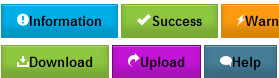
Google+ GreenGoogle+ BlueGoogle+ RedGoogle+ YellowGoogle+ Gray

 1. login terlebih dahulu.
2. Pilih Template > Edit HTML,centang Expand Widget Templates.
3. Cari kode ]]></b:skin> (gunakan CTRL+F).
4. Letakan kode di bawah ini tepat di atas kode ]]></b:skin>.


<style>
.PlusGreen {
    display: inline-block;
    background: #45ad45;
    background: -webkit-gradient(linear, left top, left bottom, color-stop(0%,#47af47), color-stop(100%,#43ab43));
    background: -moz-linear-gradient(center top, #47af47 0%, #43ab43 100%);
    -webkit-border-radius: 2px;
    -moz-border-radius: 2px;
    border-radius: 2px;
    -webkit-transition: background-color .218ss 0;
    -moz-transition: background-color .218ss 0;
    -o-transition: background-color .218ss 0;
    transition: background-color .218ss 0;
    text-shadow: 1px 0px 0px #1a8f1a;
    padding: 7px 12px;
    margin: 0px 12px 0px 0px;
    display: inline-block;
    border-color: #1a8f1a;
    border-width: 1px;
    border-style: solid;
    text-decoration: none;
    font-family: Helvetica, Arial, sans-serif;
    font-size: 12px;
    color: #ffffff;
    font-weight: bold;
}
.PlusGreen:hover {
    background: #33a833;
    -webkit-box-shadow: 1px 1px #d8d8d8;
    -moz-box-shadow: 1px 1px #d8d8d8;
    box-shadow: 1px 1px #d8d8d8;
    text-shadow: 1px 1px 0px #284c28;
    border-color: #284c28;
}
.PlusGreen:active {
    background: #359c35;
    -webkit-box-shadow: 1px 1px 3px #329432 inset;
    -moz-box-shadow: 1px 1px 3px #329432 inset;
    box-shadow: 1px 1px 3px #329432 inset;
    border-color: #2d4d2d;
}

.PlusYellow {
    display: inline-block;
    background: #fbfb00;
    background: -webkit-gradient(linear, left top, left bottom, color-stop(0%,#FCFD22), color-stop(100%,#f9f911));
    background: -moz-linear-gradient(center top, #FCFD22 0%, #f9f911 100%);
    -webkit-border-radius: 2px;
    -moz-border-radius: 2px;
    border-radius: 2px;
    text-shadow: 1px 1px 0px #FFFFF;
    padding: 7px 12px;
    margin: 0px 12px 0px 0px;
    display: inline-block;
    border-color: #e4e416;
    text-decoration: none;
    border-width: 1px;
    border-style: solid;
    font-family: Helvetica, Arial, sans-serif;
    font-size: 12px;
    color: #6E6E6E;
    font-weight: bold;
}
.PlusYellow:hover {
    background: #ffff19;
    -webkit-box-shadow: 1px 1px #d8d8d8;
    -moz-box-shadow: 1px 1px #d8d8d8;
    box-shadow: 1px 1px #d8d8d8;
    text-shadow: 1px 1px 0px #ffe01a;
    border-color: #ffe01a;
    color: #333;
}
.PlusYellow:active {
    color: #000;
}
.PlusGray {
    display: inline-block;
    background: #f3f3f3;
    background: -webkit-gradient(linear, left top, left bottom, color-stop(0%,#f5f5f5), color-stop(100%,#f1f1f1));
    background: -moz-linear-gradient(center top, #f5f5f5 0%, #f1f1f1 100%);
    -webkit-border-radius: 2px;
    -moz-border-radius: 2px;
    border-radius: 2px;
    -webkit-transition: border-color .218s 0;
    -moz-transition: border-color .218s 0;
    -o-transition: border-color .218s 0;
    transition: border-color .218s 0;
    text-shadow: 1px 1px 0px #ffffff;
    padding: 7px 12px;
    margin: 0px 12px 0px 0px;
    display: inline-block;
    text-decoration: none;
    border-color: #DCDCDC;
    border-width: 1px;
    border-style: solid;
    font-family: Helvetica, Arial, sans-serif;
    font-size: 12px;
    color: #6E6E6E;
    font-weight: bold;
}
.PlusGray:hover {
    -webkit-box-shadow: 0px 2px #00002;
    -moz-box-shadow: 0px 2px #00002;
    box-shadow: 0px 2px #00002;
    border-color: #999;
    color: #333;
}
.PlusGray:active {
    -webkit-box-shadow: 1px 1px 3px #dedede inset;
    -moz-box-shadow: 1px 1px 3px #dedede inset;
    box-shadow: 1px 1px 3px #dedede inset;
    border-color: #444;
    color: #000;
}
.PlusBlue {
    display: inline-block;
    background: #3079ed;
    background: -webkit-gradient(linear, left top, left bottom, color-stop(0%,#327BEF), color-stop(100%,#2E77EB));
    background: -moz-linear-gradient(center top, #327BEF 0%, #2E77EB 100%);
    -webkit-border-radius: 2px;
    -moz-border-radius: 2px;
    border-radius: 2px;
    -webkit-transition: border-color .218s 0;
    -moz-transition: border-color .218s 0;
    -o-transition: border-color .218s 0;
    transition: border-color .218s 0;
    text-shadow: 1px 0px 0px #1a378e;
    padding: 7px 12px;
    margin: 0px 12px 0px 0px;
    display: inline-block;
    border-color: #0066cc;
    text-decoration: none;
    border-width: 1px;
    border-style: solid;
    font-family: Helvetica, Arial, sans-serif;
    font-size: 12px;
    color: #ffffff;
    font-weight: bold;
}
.PlusBlue:hover {
    background: #2D71EE;
    -webkit-box-shadow: 1px 1px #d8d8d8;
    -moz-box-shadow: 1px 1px #d8d8d8;
    box-shadow: 1px 1px #d8d8d8;
    text-shadow: 1px 1px 0px #001AA6;
    border-color: #291f93;
}
.PlusBlue:active {
    background: #2A69EF;
    background: -webkit-gradient(linear, left top, left bottom, color-stop(0%,#327aef), color-stop(100%,#2e76eb));
    background: -moz-linear-gradient(center top, #327aef 0%, #2e76eb 100%);
    -webkit-box-shadow: 1px 1px 3px 0px #0066cc inset;
    -moz-box-shadow: 1px 1px 3px 0px #0066cc inset;
    box-shadow: 1px 1px 3px 0px #0066cc inset;
    text-shadow: 1px 1px 0px #001AA6;
    border-color: #444444;
}
.PlusRed {
    display: inline-block;
    text-decoration: none;
    background: #eb3232;
    background: -webkit-gradient(linear, left top, left bottom, color-stop(0%,#FC2222), color-stop(100%,#F81111));
    background: -moz-linear-gradient(center top, #FC2222 0%, #F81111 100%);
    -webkit-border-radius: 2px;
    -moz-border-radius: 2px;
    border-radius: 2px;
    -webkit-transition: background-color .218s 0;
    -moz-transition: background-color .218s 0;
    -o-transition: background-color .218s 0;
    transition: background-color .218s 0;
    text-shadow: 1px 1px 0px #a60000;
    padding: 7px 12px;
    margin: 0px 12px 0px 0px;
    display: inline-block;
    border-color: #cc0000;
    border-width: 1px;
    border-style: solid;
    font-family: Helvetica, Arial, sans-serif;
    font-size: 12px;
    color: #ffffff;
    font-weight: bold;
}
.PlusRed:hover {
    -webkit-box-shadow: 1px 1px #d8d8d8;
    -moz-box-shadow: 1px 1px #d8d8d8;
    box-shadow: 1px 1px #d8d8d8;
    text-shadow: 1px 1px 1px #a60000;
    border-color: #912020;
}
.PlusRed:active {
    background: #ed2b2b;
    background: -webkit-gradient(linear, left top, left bottom, color-stop(0%,#ed3232), color-stop(100%,#eb2f2f));
    background: -moz-linear-gradient(center top, #ed3232 0%, #eb2f2f 100%);
    -webkit-box-shadow: 1.5px 1.5px 3px #cc0000 inset;
    -moz-box-shadow: 1.5px 1.5px 3px #cc0000 inset;
    box-shadow: 1.5px 1.5px 3px #cc0000 inset;
    border-color: #ad4b4b;
}
</style>

5. Kemudian save

Untuk penggunaanya,silahkan sobat buat dalam postingan dan letakan/pilih salah satu kode yang di perlukan dan letakan pada bagian HTML bukan Compase.


<a href="#" class="PlusGreen">Google+ Green</a>
<a href="#" class="PlusBlue">Google+ Blue</a>
<a href="#" class="PlusRed">Google+ Red</a>
<a href="#" class="PlusYellow">Google+ Yellow</a>
<a href="#" class="PlusGray">Google+ Gray</a>


Gimana mudah kan,buat yang tertarik selamat mencoba semoga berhasil.

Cara Membuat Box Email Hover Style Subscription with css


Salam sobat,gimana kabarnya....? kita jumpa lagi,sebelumnya saya sudah banyak membahas tentang tentang tampilan button dengan CSS,kini saya coba buat artikel tentang cara membuat tampilan box email dengan hover style,terdapat lima social box yang bisa sobat gunakan sebagi petunjuk halaman buku.Buat sobat yang ingin mencobanya silahkan ikuti tutorialnya karena ini sangat mudah.

1. Login dulu ke blog sobat.
2. Pilih Tata letak > Add Gadget.
3. Pilih HTML/Javascript.
4. Pastekan kode di bawah pada kolom konten.

<style>
.tbisubscribe {
border: 1px solid #D3D3D3;
padding: 8px;
width: 300px;
-webkit-transition: all 0.5s ease-in-out;
-moz-transition: all 0.5s ease-in-out;
-ms-transition: all 0.5s ease-in-out;
-o-transition: all 0.5s ease-in-out;
transition: all 0.5s ease-in-out;
}
.tbisubscribe:hover {
-moz-box-shadow: inset 1px 1px 10px 1px rgba(249, 215, 126, 1);
-webkit-box-shadow: inset 1px 1px 10px 1px rgba(249, 215, 126, 1);
box-shadow: inset 1px 1px 10px 1px rgba(249, 215, 126, 1);
}
.tbimailbox {
border: 1px solid #D3D3D3;
-webkit-border-radius: 4px;
border-radius: 4px;
-moz-box-shadow: 1px 1px 1px 1px rgba(255, 172, 84, 0.4) inset;
-webkit-box-shadow: 1px 1px 1px 1px rgba(0, 0, 0, 0.4) inset;
box-shadow: 1px 1px 1px 1px rgba(0, 0, 0, 0.4) inset;
color: #666;
font: 14px "trebuchet ms", sans-serif;
padding: 7px 15px;
width: 160px;
-webkit-transition: all 0.5s ease-in-out;
-moz-transition: all 0.5s ease-in-out;
-ms-transition: all 0.5s ease-in-out;
-o-transition: all 0.5s ease-in-out;
transition: all 0.5s ease-in-out;
}
.tbimailbox:hover {
-webkit-box-shadow: none;
box-shadow: none;
-webkit-transition: all 0.5s ease-in-out;
-moz-transition: all 0.5s ease-in-out;
-ms-transition: all 0.5s ease-in-out;
-o-transition: all 0.5s ease-in-out;
transition: all 0.5s ease-in-out;
}
.tbisubmit {
font: bold 12px Tahoma, Geneva, sans-serif;
font-style: normal;
color: #ffffff;
background: #ff5714;
border: 0px solid #ffffff;
text-shadow: 0px -1px 1px #222222;
box-shadow: 2px 2px 5px #000000;
-moz-box-shadow: 2px 2px 5px #000000;
-webkit-box-shadow: 2px 2px 5px #000000;
border-radius: 10px 10px 10px 10px;
-moz-border-radius: 10px 10px 10px 10px;
-webkit-border-radius: 10px 10px 10px 10px;
padding: 8px 15px;
cursor: pointer;
margin: 0 auto;
}
.tbisubmit:active {
cursor: pointer;
position: relative;
top: 2px;
}
.tbisubmit::-moz-focus-inner {
border: 0;
padding: 0;
margin: 0;
}
</style>
<link href='http://fonts.googleapis.com/css?family=Oswald' rel='stylesheet' type='text/css' />
<div class='tbisubscribe'>
<div style='color: #666666; font-weight: bold; font: 22px Oswald, cursive; margin: 0px 0px 10px 15px;'>Get Free Updates in your Inbox</div>
<div style='margin: 10px 0 0 6px;'>
<form action='http://feedburner.google.com/fb/a/mailverify' class='emailform'
method='post' onsubmit='window.open(&apos;http://feedburner.google.com/fb/a/mailverify?uri=pengembarabiru&apos;, &apos;popupwindow&apos;, &apos;scrollbars=yes,width=550,height=520&apos;);return true'
style='margin: 0pt;' target='popupwindow'>
<input name='uri' type='hidden' value='pengembarabiru' />
<input name='loc' type='hidden' value='en_US' />
<input class='tbimailbox' name='email' onblur='if (this.value == &quot;&quot;) {this.value = &quot;Enter your email...&quot;;}'
onfocus='if (this.value == &quot;Enter your email...&quot;) {this.value = &quot;&quot;}'
type='text' value='Enter your email...' />
<input alt='' class='tbisubmit' title='' type='submit' value='Subscribe'/>
</form>
</div>
<div style='border: none; color: #666666; font: 22px Oswald, cursive; margin: 25px 0 0 5px;'>Follow us on:</div>
<div style='margin: -32px 0 0 120px;'>
<a href='FACEBOOK URL' target='_blank' title='Join us on Facebook'><img src='https://blogger.googleusercontent.com/img/b/R29vZ2xl/AVvXsEg0auuTC2rEjXfV1JXHG_f9yKgr6MkYdkuYEFblHRSOE_d8ztyfjJPCD29xyVd3yJoIqqr32RcGrlJmXxEWkCE1EX7X83wmicQWntufAsdScyS6FhSPdQuCxaCb1_ftqriqQsu85nXc63A/s1600/facebook500.png' alt='facebook'/></a>
<a href='TWITTER URL Sobat' rel='nofollow' target='_blank'
title='Follow us on Twitter'><img src='https://blogger.googleusercontent.com/img/b/R29vZ2xl/AVvXsEgfMpOtHgQB3uBzwdDVShLjvftDqv1eXchsdXyrASugO2ryiG4Jiyt1uNE-94CHCA0N7tio_f6d34om50V-o7ArV-FQHstbMSFpUxcsCCQa9DgOJBxRKwvw81f1mWYXI8Lfn4OAKk2cDuU/s1600/twitter.png' alt='twitter'/></a>
<a href='GOOGLE+ URL Sobat' rel='nofollow' target='_blank'
title='Follow us on Google+'><img src='https://blogger.googleusercontent.com/img/b/R29vZ2xl/AVvXsEhNxEyc1Y8FtPuFKUZpmwleD0ro5pFXYLfB9u-FuEMQkCzQ8t8rZMHSyeFLG2jyr5TAVhLHWN28obzIePbtajmBZ9z-94E7TDwnnfBGYT6qjBmRgA_dHcrb2xL5PvTMi8CihUOOxVS-Hxo/s1600/googleplus-revised.png' alt='gplus'/></a>
<a href='PINTEREST URL Sobat' rel='nofollow' target='_blank'
title='Follow us on Pinterest'><img src='https://blogger.googleusercontent.com/img/b/R29vZ2xl/AVvXsEiJhwwueh19_dABilH875TVWqQABIlJfDn6iGGJz6Z0Lc_T9CjVOk9mGCYQF_F6MhnE_oBRQInGoiG4S2D4Mhk6wX0T8jB5WvcxkhUb0K9Q1n6AbDW43ulrqjz63R33RYf2LIinJZUvMwI/s1600/pinterest.png' alt='pinterest'/></a>
<a href='RSS URL Sobat' rel='nofollow' target='_blank'
title='Subscribe to RSS'><img src='https://blogger.googleusercontent.com/img/b/R29vZ2xl/AVvXsEi8Zd92EXNVPf-N0pbkVbUItO6V8Z8CPF08-VTyQYKoEzS_PiMtHzesAXyZ5s888nyaqFr6KvCPpoGEnc5yvbF26rGo6hFrQdHyYFdrO-t5BjfcgbrHzxwsxOaal2dAWUnMwPnpVSaShSo/s1600/rss.png' alt='rss'/></a>
</div>
</div>


Keterangan:
Untuk tulisan yang berwarna Hijau bisa sobat ganti dengan nama sobat.
Untuk tulisan yang berwarna Merah Silahkan ganti dengan URL yang di tuju.

Setelah semuanya beres kemudian save,dan silahkanlihat hasilnya.

Membuat Animasi Post Popular Dengan Hover CSS3


1. Login dulu ke akun blog sobat.
2. Pilih Template > Edit Template > Centang expand Widget Templates.
3. Backup Dulu untuk menjaga kesalahan.
4. Cari kode ]]></b:skin> dan letakan kode di bawah tepat di atas kode ]]></b:skin>.


.post h2 {
margin:.1em 0 0;
padding:0 0 4px;
font-size:1.0em;
font-weight:normal;
line-height:2.5em;
color:#444;
font-family: Oswald, Serif;
}
.post h2 a, .post h2 a:visited, .post h2 strong {
display:block;
text-decoration:none;
color:#444;
font-size:2.0em;
font-weight:normal;
font-family: Oswald, Serif;
}
.post h2 strong, .post h2 a:hover {
color:#0274be;
background: url("http://iconkits.com/images/vip/aerozone_arrow_small_preview.png") no-repeat 4px center transparent;
padding: 3px 10px 3px 50px;
-moz-transition: all 1s ease-out;
-o-transition: all 1s ease-out;
-webkit-transition: all 1s ease-out;
-ms-transition: all 1s ease-out;
transition: all 1s ease-out;
}


5. Setelah beres kemudian save dan silahkan lihat hasilnya.

Cara Membuat Tombol Download Dan Demo Dengan CSS


1. Sepeti biasa login dulu ke akun blog sobat.
2. Pilih Template > Edit HTML,kemudian centang Expand Widget Templates
3. Cari kode [[></b:skin> dan letakan kode di bawah tepat di atas kode ]]></b:skin>


.SRB{ background: rgba(0, 0, 0, .08); display: inline-block; padding: 5px; border-radius: 30px; -moz-border-radius: 30px; -webkit-border-radius: 30px; }
.SRB a { color: #fff; border: 1px solid rgba(0, 0, 0, .3); display: inline-block; padding: .6em 1.2em; position: relative; text-decoration: none; text-shadow: 1px 1px 1px rgba(0, 0, 0, 0.5); border-radius: 30px; -moz-border-radius: 30px; -webkit-border-radius: 30px; box-shadow: inset 0 1px 0 rgba(255, 255, 255, .4); -moz-box-shadow: inset 0 1px 0 rgba(255, 255, 255, .4); -webkit-box-shadow: inset 0 1px 0 rgba(255, 255, 255, .4); }

.SRB a.red { background: #c60000; background: linear-gradient(top, #c60000 0%, #b20000 100%); background: -moz-linear-gradient(top, #c60000 0%, #b20000 100%);
background: -webkit-gradient(linear, left top, left bottom, color-stop(0%, #c60000), color-stop(100%, #b20000)); background: -webkit-linear-gradient(top, #c60000 0%, #b20000 100%); }

.SRB a.orange { background: #f99015; background: linear-gradient(top, #f99015 0%, #f76c0f 100%); background: -moz-linear-gradient(top, #f99015 0%, #f76c0f 100%); background: -webkit-gradient(linear, left top, left bottom, color-stop(0%,#f99015), color-stop(100%,#f76c0f)); background: -webkit-linear-gradient(top, #f99015 0%,#f76c0f 100%); }

.SRB a.green { background: #30a146; background: linear-gradient(top, #30a146 0%, #249334 100%); background: -moz-linear-gradient(top, #30a146 0%, #249334 100%); background: -webkit-gradient(linear, left top, left bottom, color-stop(0%, #30a146), color-stop(100%, #249334)); background: -webkit-linear-gradient(top, #30a146 0%, #249334 100%); }

.SRB a.blue { background: #16a4c8; background: linear-gradient(top, #16a4c8 0%, #1086b6 100%); background: -moz-linear-gradient(top, #16a4c8 0%, #1086b6 100%); background: -webkit-gradient(linear, left top, left bottom, color-stop(0%, #16a4c8), color-stop(100%, #1086b6)); background: -webkit-linear-gradient(top, #16a4c8 0%, #1086b6 100%); }

.SRB a.gray { background: #c2c2c2; background: linear-gradient(top, #c2c2c2 0%, #aeaeae 100%); background: -moz-linear-gradient(top, #c2c2c2 0%, #aeaeae 100%); background: -webkit-gradient(linear, left top, left bottom, color-stop(0%, #c2c2c2), color-stop(100%, #aeaeae)); background: -webkit-linear-gradient(top, #c2c2c2 0%, #aeaeae 100%); }

.SRB a.dark { background: #464646; background: linear-gradient(top, #464646 0%, #343434 100%); background: -moz-linear-gradient(top, #464646 0%, #343434 100%); background: -webkit-gradient(linear, left top, left bottom, color-stop(0%, #464646), color-stop(100%, #343434)); background: -webkit-linear-gradient(top, #464646 0%, #343434 100%); }

.SRB a:hover, .SRB:hover { color: #fff; opacity: .7 }

4. Kemudian save.


Untuk penggunaan dalam postingan bisa sobat gunakan kode kode di bawah.

Button Text

<span class="SRB"><a class="green" href="#" rel="nofollow" target="_blank"> Button Text </a></span>

<span class="SRB"><a class="orange" href="#" rel="nofollow" target="_blank"> Button Text </a></span>

<span class="SRB"><a class="red" href="#" rel="nofollow" target="_blank"> Button Text </a></span>

<span class="SRB"><a class="gray" href="#" rel="nofollow" target="_blank"> Button Text </a></span>

<span class="SRB"><a class="dark" href="#" rel="nofollow" target="_blank"> Button Text </a></span>

<span class="SRB"><a class="blue" href="#" rel="nofollow" target="_blank"> Button Text </a></span>
Keterangan :

Untuk tulisan berwarna merah menunjukan tempat URL
Untuk tulisan berwarna hijau menunjukan nama button


Selesai sudah tutorial kali ini terima kasih atas partisipasinya semoga dapat sedikit membantu buat sobat semuanya.

Wednesday, 31 July 2013

Back To Top Menarik Dengan CSS dan jQuery


Assalamualaikum Pada kesempatan ini saya akan share mengenai cara membuat tombol back to top dengan menggunakan css dan jQuery caranya cukup sederhana jadi mudah untuk diterapkan
nah jika tertarik lansung saja ikuti langkah dibawah ini

Masuk blog agan
pilih menu template/edit html
kemudian gunakan ctrl + f untuk menemukan kode  </body>
jika sudah ketemu letakan kode dibawah ini diatas tag  </body>

<script src='http://ajax.googleapis.com/ajax/libs/jquery/1.7.1/jquery.min.js' type='text/javascript'/>

<div class='button_up' id='button_up' style='display:none;'/>
<div class='button_down' id='button_down' style='display:none;'/>

<script>
//<![CDATA[
(function(){var special=jQuery.event.special,uid1='D'+(+new Date()),uid2='D'+(+new Date()+1);special.scrollstart={setup:function(){var timer,handler=function(evt){var _self=this,_args=arguments;if(timer){clearTimeout(timer)}else{evt.type='scrollstart';jQuery.event.handle.apply(_self,_args)}timer=setTimeout(function(){timer=null},special.scrollstop.latency)};jQuery(this).bind('scroll',handler).data(uid1,handler)},teardown:function(){jQuery(this).unbind('scroll',jQuery(this).data(uid1))}};special.scrollstop={latency:300,setup:function(){var timer,handler=function(evt){var _self=this,_args=arguments;if(timer){clearTimeout(timer)}timer=setTimeout(function(){timer=null;evt.type='scrollstop';jQuery.event.handle.apply(_self,_args)},special.scrollstop.latency)};jQuery(this).bind('scroll',handler).data(uid2,handler)},teardown:function(){jQuery(this).unbind('scroll',jQuery(this).data(uid2))}}})();

$(function() {
var $elem = $('body');
$('#button_up').fadeIn('slow');
$('#button_down').fadeIn('slow');
$(window).bind('scrollstart', function(){
$('#button_up,#button_down').stop().animate({'opacity':'0.2'});
});
$(window).bind('scrollstop', function(){
$('#button_up,#button_down').stop().animate({'opacity':'1'});
});
$('#button_down').click(
function (e) {
$('html, body').animate({scrollTop: $elem.height()}, 800);
} );
$('#button_up').click(
function (e) {
$('html, body').animate({scrollTop: '0px'}, 800);
} );});
//]]>
</script>

Catatan : silahkan hapus kode berwarna merah jika sebelumnya sudah ada di template anda

Selanjutnya gerakan kursor kebagian atas untuk menemukan kode ]]></b:skin>
jika sudah ketemu letakan kode dibawah ini diatas tag ]]></b:skin>

/* Up and Down Buttons with jQuery
----------------------------------------------- */
.button_up{
padding:7px; /* Distance between the border and the icon */
background-color:Darkred;
border:1px solid #CCC; /* Border Color */
position:fixed;
background: Darkred url(https://blogger.googleusercontent.com/img/b/R29vZ2xl/AVvXsEgq9JFU44n9Pq_I0zxwTIr3uTs0SfitNNjfU80HjmAHZ5P6kovn0W6yBaJUJgRn4STz9-lW3P4EI1utl90so2SvzXO8U0FhCVo57iZXon2dnM6fJyy9ZUtHQonNT_XT-OSgV2MLChwmEH8/s16/arrow_up.png) no-repeat top left;
background-position:50% 50%;
width:20px; /* Button's width */
height:20px; /* Button's height */
bottom:280px; /* Distance from the bottom */
right:5px; /* Change right to left if you want the buttons on the left */
white-space:nowrap;
cursor: pointer;
border-radius: 3px 3px 3px 3px;
opacity:0.7;
filter:progid:DXImageTransform.Microsoft.Alpha(opacity=70);
}
.button_down{
padding:7px; /* Distance between the border and the icon */
background-color:Darkred;
border:1px solid #CCC; /* Border Color */
position:fixed;
background: Darkred url(https://blogger.googleusercontent.com/img/b/R29vZ2xl/AVvXsEgk_ORMlZm76R39HO9BMGuASxgjqJRHm4ZK6Pd1ykBkT4RRu8Nsmt4aPifunP0TI9CA82P0_8rlQYpkPbJbLcOc8gIexICIoq5s8skEi9Yl5b0eY7xNNfwEokPzayHO8MrybbfLfsrLtRg/s16/arrow_down.png) no-repeat top left;
background-position:50% 50%;
width:20px; /* Button's width */
height:20px; /* Button's height */
bottom:242px; /* Distance from the bottom */
right:5px; /* Change right to left if you want the buttons on the left */
white-space:nowrap;
cursor: pointer;
border-radius: 3px 3px 3px 3px;
opacity:0.7;
filter:progid:DXImageTransform.Microsoft.Alpha(opacity=70);
}


Terakhir silahkan simpan template anda dan lihat hasinya
 selamat mencoba semoga bermanfaat.....

Membuat Tombol Sosial Media Keren Menggunakan CSS3


Pada postingan ini saya saya akan share tentang bagaimana cara menambahkan tombol sosial media keren di blog menggunakan CSS 3 caranya sangat mudah gan dan agan patut mencobanya hehe...
baikalah gan lansung saja pada langkah langkahnya..

Masuk blog agan
pilih menu template/edit html
cari kode ]]></b:skin> gunakan ctrl + f untuk memudahkan pencarian
jika sudah ketemu lansung aja letakan kode dibawah ini tepat diatas tag ]]></b:skin>

.bubblewrap{
list-style-type:none;
margin:0;
padding:0;
}

.bubblewrap li{
display:inline;
width: 65px;
height:60px;
}

.bubblewrap li img{
width: 55px; /* width of each image.*/
height: 60px; /* height of each image.*/
border:0;
margin-right: 12px; /*spacing between each image*/
-webkit-transition:-webkit-transform 0.1s ease-in; /*animate transform property */
-o-transition:-o-transform 0.1s ease-in; /*animate transform property in Opera */
}

.bubblewrap li img:hover{
-moz-transform:scale(1.8); /*scale up image 1.8x*/
-webkit-transform:scale(1.8);
-o-transform:scale(1.8);
}

Setelah itu silahkan save template anda terlebih dahulu
kemudian kita beralih ke munu tata letak/add gadged
lalu letakan kode dibawah ini pada box yang tersedia

<center><ul class="bubblewrap">
<li><a href="Kode agan disini "><img src="http://img42.imageshack.us/img42/7086/stumbleuponlj.png" title="Add to Stumbleupon" /></a></li>
<li><a href="Kode agan disini "><img src="http://img253.imageshack.us/img253/835/facebookv.png" title="Add to Facebook" /></a></li>
<li><a href="Kode agan disini "><img src="http://img832.imageshack.us/img832/5893/twittermx.png" title="Add to Twitter" /></a></li>
<li><a href="Kode agan disini "><img src="http://img4.imageshack.us/img4/2004/rssqn.png" title="Add RSS Feed" /></a></li>
</ul>
</center>


Catatan : Silahkan sesuaikan kode berwarna merah dengan kode sosial media anda


Jika sudah silahkan simpan template agan dan lihat hasilnya...

Selamat mencoba tombol sosial media barunya semoga bermanfaat....